How to...Profile Data
The art of Data Preparation is understanding the dataset in order to understand what might need to be done to prepare the dataset for analysis. Understanding the profile of the data is a key step in forming a full view of the data. Without the dat profiling, it is easy to miss an obvious preparation step, or add in unnecessary work.
Understanding the profile of your data is made a lot easier within Tableau Prep and ensure you will be able to prepare your dataset more thoroughly and with less iterations than you would otherwise.
What is a Dataset's Profile?
By profile, we mean the characteristics of the dataset. As discussed in earlier posts, understanding the types of data you have in the dataset is essential in understanding it. As is the make-up of dimensions. Asking yourself, what level of granularity the dataset is at will help you to understand if there is duplication of records that may need to be undone in the data preparation process. All of these factors can then be the foundation of understanding the following factors about the dataset:
- Minimum, Maximum and Range of Values - does the range between the minimum and maximum values make sense.
- Data outside of Limits - are there natural limits in the data like 100% or current dates that can not be exceeded but have been?
- Outliers - Do most of the values lie inside a range but a value, or a few values, sit vastly outside of that consistent range?
- Irregular number of records - are there a consistent number of rows for certain dimensions and does this suddenly differ?
- Missing data - are there certain values that are just not present in the dataset that should be? Are there nulls where you would expect a value to be?
Checking for all these factors can be quite time consuming but there are ways to make this task easier and more intuitive.
Why is visualising the dataset important?
Anscombe Quartet
If you have read any books on Data Visualisation, then you are likely to have come across Anscombe's Quartet. For those that haven't, let me introduce you to the very best argument why descriptive statistics isn't enough to understand what is going on in a dataset. Francis Anscombe in 1973 constructed a data set that has largely the same descriptive statistics that potentially could hide significant findings in the data.

As we can see above, there is a significant range of values but most of the major descriptive statistics are largely similar:
- Means x = 9, y = 7.5
- Sample Variance x = 11, y = 4.5
- Correlation, Linear Regression and Coefficient of Determination are all similar to 2 or 3 decimal places
However, when visualising the individual data points, the data sets are actually very different.

Therefore, when preparing requires visualising the data in some basic ways to not necessarily just form an analysis but to understand whether the data is as expected. If it isn't, those rogue data points should not just be removed, but effort should be made to understand why they differ from expectation.
Importance of Visualisation vs Data Tables
Maybe by viewing the underlying data that forms Anscombe's Quartet you would spot the variables that were not as expected, like the outlier on the x- and y-axis in Set 4. But tables are tough to make those kind of assessments. By using a dataset larger than Anscombe's you are increasingly risking missing key points that you need to be aware of in your Data Preparation. Your eyes are a fantastic tool at spotting patterns so let's make life easier for ourselves when it comes to finding oddities within our data. Using data visualisation techniques, it becomes much easier to find those outliers or missing data items.

Without visualising the dataset above on London Theatre shows, you might spot a couple of the issues at first glance but so they all show? To assist in understanding this dataset, let's use Prep's built in Profile Pane to help us spot things to investigate.
If you have read any books on Data Visualisation, then you are likely to have come across Anscombe's Quartet. For those that haven't, let me introduce you to the very best argument why descriptive statistics isn't enough to understand what is going on in a dataset. Francis Anscombe in 1973 constructed a data set that has largely the same descriptive statistics that potentially could hide significant findings in the data.

As we can see above, there is a significant range of values but most of the major descriptive statistics are largely similar:
- Means x = 9, y = 7.5
- Sample Variance x = 11, y = 4.5
- Correlation, Linear Regression and Coefficient of Determination are all similar to 2 or 3 decimal places
However, when visualising the individual data points, the data sets are actually very different.

Importance of Visualisation vs Data Tables
Maybe by viewing the underlying data that forms Anscombe's Quartet you would spot the variables that were not as expected, like the outlier on the x- and y-axis in Set 4. But tables are tough to make those kind of assessments. By using a dataset larger than Anscombe's you are increasingly risking missing key points that you need to be aware of in your Data Preparation. Your eyes are a fantastic tool at spotting patterns so let's make life easier for ourselves when it comes to finding oddities within our data. Using data visualisation techniques, it becomes much easier to find those outliers or missing data items.
Without visualising the dataset above on London Theatre shows, you might spot a couple of the issues at first glance but so they all show? To assist in understanding this dataset, let's use Prep's built in Profile Pane to help us spot things to investigate.
How does Prep Profile the data?
By loading the London Theatre shows dataset in to Prep Builder and adding a Clean Step, the first step most people take, Prep instantly visualises the profile of the data in the Profile Pane for you.

From what looks, like a relatively straight-forward dataset when looking at the data for in the table format, the Profile Pane demonstrates there is actually a lot of differences. Before assessing this particular dataset, let's dig in to what happens in the Profile Pane in Prep:
Histograms and Mini-Histograms
Without Prep Builder, a lot of my early investigation of datasets which I hadn't used before involved building a lot of histograms. Often, looking at the number of records found for each value or date to determine the profile of the data as well as understand it's completeness.
Prep Builder does exactly this for me. No more time spent forming these charts and instead that time can be spent cleaning, investigating more datasets or getting to the analysis sooner. This is the genius of the Profile Pane - the user can see the profile of their data instantly. Each of the histograms, whether Blue or Grey bars, help the user to spot trends and gaps quickly. Each bar length, regardless of colour, demonstrates the number of rows that has those values.

The blue bars are where Tableau Prep has summarised the data in to bins (groups) of similar ranges of data. Therefore, you will see gaps in your data where no records exist within that range. You can also very quickly see the most common values too as they will be the longest bars.

The grey bars are where either there are not enough values to form bins of similar values or you are analysing a dimensional value instead. The difference with the grey bars are that you will not see missing values. As you are showing the number of records for each value in that column, there will be no gaps like you have when bins are formed.
Where Prep can not fit the histogram in to the Profile Pane space, it will create a scrolling histogram of the main bars, but will also create a mini-histogram in the top-right corner of the data fields Profile.
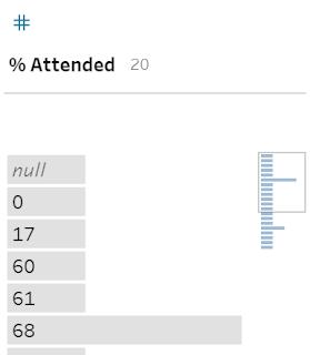
Although this mini-histogram looks like just an icon indicating there is more data, this isn't the case. The mini-histogram is a representation of the actual data. The box around the mini-histogram is an indication of what part of the data field is shown in the data field's Profile Pane.
Summary vs Detail
Tableau Prep will automatically form the summarised view of the data where there are lots of values. This is very common for measures but will also happen for dates. This can be confusing as to what values Prep is showing or has taken in from the data source. If you want to check exact values rather than the summary formed in histogram bins, then you can change in the menu available within the data field within the Profile Pane.

The more precision available from the Detail pane can add another way to investigate patterns within the histogram that you don't expect to find.
Highlighting Values
The ability to click on a value and find all other values that are found in the records featuring the selected value is another way to understand the profile of the data.

Like most data visualisations, the consumer is intelligent and therefore, as soon as we've understood something about the dataset, there is another follow-up question. This highlighting is a way that Prep Builder allows the user to dig deeper into what is within the dataset and ask these secondary questions.
This technique is particularly useful when assessing the records that have null values in certain columns.

Dimension Counts
The final way to view the Profile of the data is to understand how many members there are of a dimension. This is shown at the top of a data field within the Profile Pane.

In this case, there are seven different dates within the dataset. When this is more or less than expected, this little number can quickly help to understand where an issue might lie.

From what looks, like a relatively straight-forward dataset when looking at the data for in the table format, the Profile Pane demonstrates there is actually a lot of differences. Before assessing this particular dataset, let's dig in to what happens in the Profile Pane in Prep:
Histograms and Mini-Histograms
Without Prep Builder, a lot of my early investigation of datasets which I hadn't used before involved building a lot of histograms. Often, looking at the number of records found for each value or date to determine the profile of the data as well as understand it's completeness.
Prep Builder does exactly this for me. No more time spent forming these charts and instead that time can be spent cleaning, investigating more datasets or getting to the analysis sooner. This is the genius of the Profile Pane - the user can see the profile of their data instantly. Each of the histograms, whether Blue or Grey bars, help the user to spot trends and gaps quickly. Each bar length, regardless of colour, demonstrates the number of rows that has those values.

The blue bars are where Tableau Prep has summarised the data in to bins (groups) of similar ranges of data. Therefore, you will see gaps in your data where no records exist within that range. You can also very quickly see the most common values too as they will be the longest bars.

The grey bars are where either there are not enough values to form bins of similar values or you are analysing a dimensional value instead. The difference with the grey bars are that you will not see missing values. As you are showing the number of records for each value in that column, there will be no gaps like you have when bins are formed.
Where Prep can not fit the histogram in to the Profile Pane space, it will create a scrolling histogram of the main bars, but will also create a mini-histogram in the top-right corner of the data fields Profile.

Although this mini-histogram looks like just an icon indicating there is more data, this isn't the case. The mini-histogram is a representation of the actual data. The box around the mini-histogram is an indication of what part of the data field is shown in the data field's Profile Pane.
Summary vs Detail
Tableau Prep will automatically form the summarised view of the data where there are lots of values. This is very common for measures but will also happen for dates. This can be confusing as to what values Prep is showing or has taken in from the data source. If you want to check exact values rather than the summary formed in histogram bins, then you can change in the menu available within the data field within the Profile Pane.

The more precision available from the Detail pane can add another way to investigate patterns within the histogram that you don't expect to find.
Highlighting Values
The ability to click on a value and find all other values that are found in the records featuring the selected value is another way to understand the profile of the data.

Like most data visualisations, the consumer is intelligent and therefore, as soon as we've understood something about the dataset, there is another follow-up question. This highlighting is a way that Prep Builder allows the user to dig deeper into what is within the dataset and ask these secondary questions.
This technique is particularly useful when assessing the records that have null values in certain columns.

Dimension Counts
The final way to view the Profile of the data is to understand how many members there are of a dimension. This is shown at the top of a data field within the Profile Pane.
In this case, there are seven different dates within the dataset. When this is more or less than expected, this little number can quickly help to understand where an issue might lie.


