Posts

Showing posts from May, 2019

2019: Week 16

Image
A few weeks back we mentioned that we were cleaning up our mailing lists. Well, now our marketing department is looking to generate further revenue and believes a great way of doing that is rewarding our highest spending customers by emailing them “15 per scent discount” codes! They’ve decided the optimal cut-off for who receives these codes is the top 8% of customers by total sales from orders placed within the last 6 months. Why top 8%? For valid reasons, not just to stop people from mentally working out where the 10% cut off is I'm sure. To help you, they’ve zipped up a bunch of data and sent it over to you (though it seems like in their haste they may have sent some unnecessary files over too). The data contains sales for the last 12 months (as of 24/05/2019). From this they want a list of all the email addresses for the top 8% of customers (by total sales over the last 6 months) along with their rank (by total sales over… you get the idea) and the total sales value. The

2019: Week 15 Solution

Image
You can view our solution workflow below and download it here . Full solution workflow. There are 3 main learning objectives for this week's Preppin' Data challenge: Using "Wildcard Unions" & file paths. Using aggregations to calculate "percent of total" fields. Creating Filter calculations. Unioning the data and getting the regions We’ve got five CSVs, one for each region, and all of them have the same data structure – sounds like a call for a Wildcard Union input! Instead of inputting each file separately we can: Applying a Wildcard Union Add one of regional stock files to the canvas. Switch to the Multiple Files tab. Select Wildcard Union . If they share a folder with other files, define a “ Matching Pattern ” of “* Stock Purchases.csv”.  This means only  files that end in “Stock Purchases.csv” will be imported into the union. Click Apply . From here, Tableau Prep automatically unions all the data together for yo

2019: Week 14 Solution

Image
Each week I normally like to outline some key points and main learning objectives, however today I’m offering a full walk-through of the solution, so everyone can understand the logic involved at each step. You can see our solution below and download it here . Before I go into the full walk-through, I’d first like to provide some reassurance that this is a difficult challenge and our trim and streamlined solution was the result of iteration and feedback! If anyone got a flow that looks anything like ours on their first try then we are seriously impressed. To add context, here are some of the original solution flows we came up with reaching the final flow seen above. -------------------- -------------------- . When trying to solve a data prep obtaining any solution is a great start as you can begin inspecting, refining, and improving it. As with many problems, iteration is a key to success! Now onto the walk-through. Cleaning the Data and Adding Flags First we

2019: Week 15

Image
Hi all, after last week's marathon challenge that challenged the creators to find the 'right' answer as much it challenge our "Preppers", I decided to go for a slightly more straight forward challenge this week [insert side-eyes emoji] - it's only easy when you can work it out! This week, we are putting ourselves in the shoes of a family firm of stock-brokers. The firm has a number of branches across the country, but thankfully they have learned from previous challenges of Preppin' Data, how to put together their lists of their clients purchases. The regulators want to know whether there are any 'weird' behaviour from their clients. Because their client base is quite small, they have agreed to send a file to the regular where the same share has been purchased by multiple customers of the firm. To give the regulator more evidence, they will share what percentage that sale makes up of the whole client portfolio of the firm and within the region.

2019: Week 14

Image
This week our challenge inspiration comes from Zen Master Emma Whyte. Please thank / blame [delete as applicable] her rather than Jonathan and myself this week. The challenge this week focuses on Whyte's Cafe based in Stevenage in the UK. The cafe has been growing well and brings in a good amount of revenue but like any business, they are trying to drive for more. Many popular lunch shops provide a 'Meal Deal' when you can purchase a drink, a snack to go with a main for a set price. Whyte's Cafe wants to know how much it would cost them to install a Meal Deal (for £5 each meal - what a bargain!) option on their menu as the ownership team believe it will entice a lot more customers through the door. The data set at Whyte's Cafe is largely excellent (we wouldn't expect anything less). Each row of data is a product sold as part of an order (ticket). Some customers are members of the cafe (a loyalty scheme) that allows to understand who is ordering. Maybe for so

2019: Week 13 Solution

Image
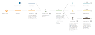
The full solution workflow can be viewed below and downloaded here . The full workflow solution There are four main learning outcomes of this week’s Preppin Data: 1. Using the DATEPART() function. 2. Flagging issues and counting the frequency of these issues. 3. Using different levels of aggregation on the same data set. 4. Using the ROUND() function. There’s also a neat little bonus learning objective to save yourself some time when repeating common process snippets. 5. Saving time by copying and pasting workflow changes and tools. Using the DATEPART() function In order to get the week, month, and quarter numbers for our data we can use the aforementioned DATEPART() function. This function takes two parameters:  DATEPART(‘name of the date part you want’, [the Date Field you want the date part for]) In our case this means we can use the following function calls to get the numbers we desire: DATEPART(‘week’, [Date] ) DATEPART(‘month’,

2019: Week 13

Image
This week, we are looking at a common challenge in customer analytics - the summary table. For new and intermediate analysts, the challenge of connecting to massive data sets and using all the data points is all too tempting. However, complexity and software performance maybe hit due to trying to work out complex calculations or rendering vast numbers of data points. After all, 'Big Data', which means a lot of things to a lot of different people, encompassed this challenge among many others. In Financial Services, the regular flow of transactions is a wonderful data source for analysis but is also a challenge. To create more simplistic snapshots of behaviour (often around balances), balances would be averaged over a time period. But what level do you need a customer's balance aggregated to? This is the challenge we will explore but for our favourite soap company, Chin & Beard Suds co . Using three different company's data who buy our products, we are looking at

2019: Week 12 Solution

Image
The full solution can be seen below and downloaded here . The full workflow. Converting date and time to DateTime Within the Manual Capture Error List   ( MCEL ) we were given [Start Date] and [Start Time] , but really we want [Start DateTime] . There were a number of ways to go about this, including converting to string and using DATEPARSE() and adding the dates together using DATEADD() . I think the simplest solution however was to use the MAKEDATETIME() function as below: MAKEDATETIME([Start Date], [Start Time]) The MAKEDATETIME() function takes the date part of the first parameter and combines it with the time part of the second parameter. In our case that means it combining the date from [Start Date] and the time from [Start Time] together. No need to do any tricky parsing or conversions as it does it for us! Filtering out overlapping errors This was the main challenge of the week – it was tricky to even figure out if it was possible. In the end we’ve come u

2019: Week 12

Image
In previous weeks of Preppin' Data we have seen the struggles of manual data capture and the impact particular on text based data. In our experience, it's not just text where the impact is felt by manually inputting data, but the accuracy of capturing all types of data. This week, we position ourselves in the shoes of IT at Chin & Beard Suds Co. The company has had a number of system outages but we need to understand the size of the issue. *this is probably quite a challenging week* Luckily for us, we have two separate data sources: 1. a set of automatically formed logs that captures service down time with a precise timestamp; 2. a manual spreadsheet where staff can capture issues they are having with systems. Sadly, for the latter data source, the data is captured without the same accuracy as the automatic logs. With the automatic logs, have we got all the data though? Help us clean the data and make clear how much downtime we are suffering from, in which system and