2021: Week 47 - Games Night Viz Collab
Challenge By: Will Sutton
Did you see the launch of #GamesNightViz a couple of weeks ago? It's a new community project which gives you the opportunity to practise your data visualisation, design and preparation skills. So we've decided to team up this week to bring you a #GamesNightViz style Preppin' challenge!
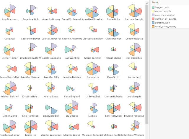
This week's challenge is about building new dimensions from #GamesNightViz's Top Female Poker Players data to better understand their successes across their poker careers. They've earned millions of dollars but was it all in one go? How many years have they been playing poker? How regularly do they win?
The resulting dataset will allow you to build a pizza plot/coxcomb chart like below, which you're welcome to do as a bonus challenge too!
Inputs
- Top 100 Female Poker Players

- Top 100 Poker Events

Requirements
- Input the Data
- Add the player names to their poker events
- Create a column to count when the player finished 1st in an event
- Replace any nulls in prize_usd with zero
- Find the dates of the players first and last events
- Use these dates to calculate the length of poker career in years (with decimals)
- Create an aggregated view to find the following player stats:
- Number of events they've taken part in
- Total prize money
- Their biggest win
- The percentage of events they've won
- The distinct count of the country played in
- Their length of career
- Reduce the data to name, number of events, total prize money, biggest win, percentage won, countries visited, career length
- Using the player stats to create two pivot tables
- a pivot of the raw values
- a pivot of the values ranked from 1-100, with 100 representing the highest value
- Note: we're using a ranking method that averages ties, pay particular attention to countries visited!
- Join the pivots together
- Output the data
- Using this data you can create a pizza plot/coxcomb chart for each poker player, see CJ Mayes' tutorial and Tableau template:
Output

- 4 fields
- name
- metric
- raw_value
- scaled_value
- 600 rows (601 including headers)


